FORM
UX Designer

This project involves designing Form, a workout app created to support both new and experienced gym-goers in building sustainable exercise habits. Form provides diverse workout options, personalized guidance, and progress tracking to help users overcome barriers such as gym anxiety, lack of motivation, and uncertainty around routines. Working closely with kinesiology peers, I identified the key challenges that keep individuals out of the gym and translated those insights into a user-centered solution aimed at making fitness more accessible, engaging, and confidence-building.
01: Overview
Many individuals face barriers that keep them from engaging in regular exercise. To better understand these challenges, I spoke with peers in kinesiology who work as physical therapy technicians, athletic trainers, and personal trainers. Their insights revealed consistent themes: fear of the gym environment, uncertainty around exercise routines, lack of motivation, time constraints, and financial limitations. These findings informed the foundation for exploring solutions aimed at reducing intimidation, increasing accessibility, and supporting long-term engagement in fitness.
02: Problem
The project began as a Coursera passion project, where I created an early version of a workout app to combine my background in kinesiology with design. Initially built to meet program requirements, the concept evolved as I collaborated with peers in kinesiology and other UX designers to better align the app with user needs. Interviews with physical therapy technicians and athletic trainers revealed that patients often struggled with consistency, proper exercise form, and confidence, guiding the development of features that provide real-time feedback and support.
Core features such as exercise mimicking, progress tracking, reminders, and community discussion posts were introduced as the design matured. The app evolved by adapting initial concepts into a more user-centered model, ultimately focusing on providing feedback during workouts to keep users engaged and consistent.
After designing the first iteration, I created personas to define key stressors and refine the experience. I then conducted multiple design reviews with peers and UX professionals, gathering critiques to ensure usability and alignment with best practices. Through continuous iteration and feedback, the final product delivered an accessible and engaging workout platform designed to build confidence and sustain long-term motivation.
03: Design Process


Pictured above: views of the first couple of iterations of Form, including the discussion screen and home screen.
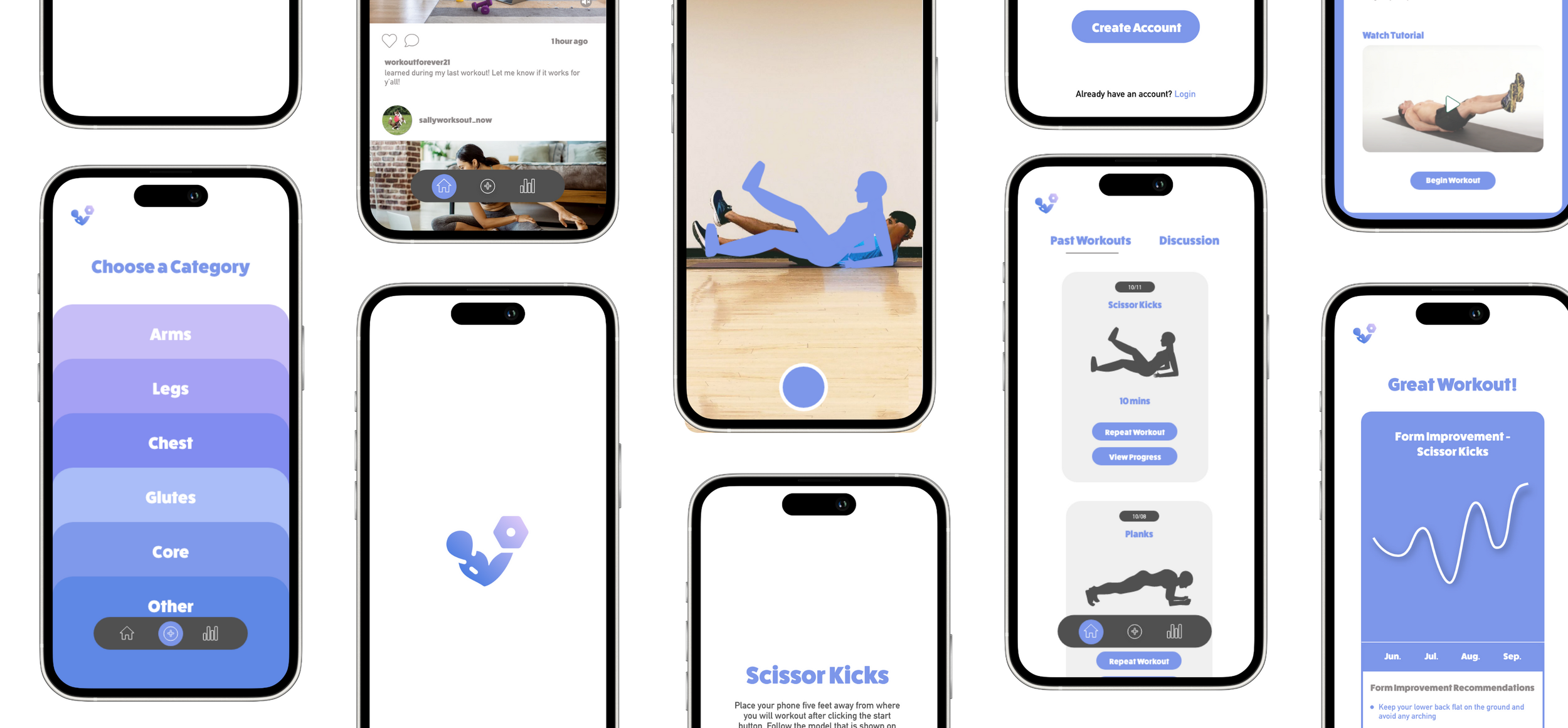
The final solution was a workout app designed to address the barriers uncovered in research—fear of the gym, lack of motivation, and uncertainty about routines. Key features included guided exercise demonstrations with real-time feedback, progress tracking, reminders, and community discussion posts to foster accountability and support. Personas and iterative testing informed the design, ensuring the interface was approachable for new users while still valuable for experienced gym-goers.
The result was a streamlined, engaging experience that encouraged users to stay consistent with their workouts. By providing feedback during exercises and visualizing progress over time, the app reduced intimidation and built user confidence. Design critiques and usability reviews confirmed that the solution effectively balanced accessibility with functionality, creating a platform that supports sustained fitness habits and promotes overall well-being.